Tedial – Composable NoCode UI Design
Emilio L. Zapata, Founder, Tedial
Over the years Gartner has come up with the concept of a composable enterprise to facilitate digital transformation. Modularity is at the heart of composability. Software-based business innovation becomes viable when organizations master the capability to assemble, reassemble and extend applications from an ecosystem of ready-made components. The application architecture needs to manage the interaction of functional components and software composition can speed up innovation processes while remaining in control of the quality and manageability of the application landscape as well.
Composable UX & UI
In digital product design, a common mistake is overloading interfaces with features that can overwhelm users and lowering their satisfaction. Composable UX addresses this by structuring experiences as modular, reusable well-scoped UI components (cards, lists, form controls, search widgets, etc.) that can be assembled to meet different user needs and contexts.
The goal of user interface (UI) design is to visually guide the user through a product’s interface. It’s about creating an intuitive experience that doesn’t require excessive mental effort. This involves removing unnecessary elements, simplifying complex interactions, and prioritizing content based on user needs, while also enhancing the overall aesthetic appeal and facilitating navigation and interaction with the interface
NoCode platforms, which are themselves built around visual components, templates, and pre-wired integrations, accelerate this process by exposing those components in visual builders, letting product teams assemble interfaces quickly without hand-coding. Why composable UX/UI fits NoCode and how microservices complete the picture:
- Microservices alignment: The modularity of UI components maps naturally to microservices: independent services expose focused APIs that match a component’s data and behavior needs
- Integration-first UX: NoCode tools usually include connectors and data bindings that make it straightforward to wire UI components to back-end sources (APIs, spreadsheets, databases, automation flows).
- Speed of assembly: Visual builders let non-developers compose interfaces from reusable components, shortening prototyping and release cycles.
- Consistency at scale: Shared component libraries and templates ensure consistent interaction patterns and visual language across multiple pages or products.
UX and UI are closely related, and the product’s interface design has a significant impact on the overall user experience. Some UX design principles for creating intuitive, meaningful, and effective UI interfaces are: User-centered design, usability and accessibility, simplicity and consistency.
NoCode WYSIWYG App Builder
Modern no-code UI app builders are a component-based architecture, using popular frontend frameworks such as React, Vue, and Angular. WYSIWYG (what you see is what you get) is the most widely used app builder in the design of user interfaces, because it provides multiple advantages:
- NoCode editing: WYSIWYG editor, combined with a form builder, provides a user-friendly interface that doesn’t require users to have coding knowledge. This simplicity makes them accessible to a wide range of users, including those without technical backgrounds.

-
- Real-time visualization: One of the key advantages of WYSIWYG editor is the ability to show users an immediate preview of how the content will appear. This instant visual feedback helps users make informed design and content decisions without needing to toggle between editing and preview modes.
- Ease of use: The editor is easy to understand. New users don’t need a time-consuming and complex training and can start creating content right away without needing to learn a programming language, making the content creation process faster and more efficient.
- Time-Saving: The immediate visual feedback and simplified interface can save a significant amount of time compared to writing code manually or using more complex design tools.
- Creativity: The editor allows you to optimize your UI for desktop and mobile, using separate sets of the component library. Because users can see the results of their changes in real-time, they can quickly experiment with different designs, layouts, and formatting options – pushing your creativity to a maximum.
- Decoupled architecture: Composable UX requires a decoupled, microservices-based architecture that allows users to work without limitations or restrictions associated with the backend.
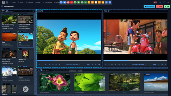
Typically, a WYSIWYG app builder includes a wide selection of customizable user interface elements (component library) that allows precise control over the appearance of each screen, on each device. Furthermore, it is complemented by a form builder because most applications (CMS, DAM, MAM, PAM) include forms to present the metadata that the user needs in an omnichannel context. This architecture enables rapid, screen-by-screen customization, giving users the flexibility to adapt their UI design.
Component Library
A WYSIWYG component is a reusable, independent, self-contained functional element that enables designers to assemble full interfaces visually, without writing code. Each component encapsulates a specific functionality — for example: video players, metadata viewers, timeline annotation tools, or media file managers — and can be freely combined to create highly customized screens tailored to user needs. Key characteristics include:
- Automatic interaction between components: Although each component is independent, it can automatically interact with others placed on the same screen. When multiple components are dragged onto the canvas, each one “discovers” the others present and activates predefined interaction logic. For example, placing a player next to a comment viewer or timeline results in automatic synchronization, requiring no configuration. This built-in intelligence ensures seamless composition: simply place components together, and they start cooperating immediately.
- Flexible configuration per component: Every component can be adapted to its specific context. A single component may display different levels of detail, allow editing or restrict interactions, or expose a tailored set of actions depending on the requirements of the screen. This flexibility avoids duplicating logic and ensures reusability across diverse scenarios.
- Reusable global configurations: Components can inherit global application settings — shared actions, form templates, search filters, display layouts, etc. — reducing repetitive setup and reinforcing consistency. These defaults can be overridden when necessary, balancing standardization with customization.
- Design for multiple contexts and environments: The platform supports creating customized screens for various usage scenarios: general browser access, mobile and tablet layouts, integrations with third-party tools (such as Adobe Premiere Pro via UXP), or simplified external-access screens with limited permissions. This adaptability enables designing experiences tailored to each user role or environment.
- Continuous evolution of the component library: The component ecosystem grows over time as new use cases emerge. By identifying evolving needs in the media and entertainment market, the library continually expands with new components that deliver real, tangible value. This ensures the platform stays up-to-date and anticipates future requirements.
Conclusions
The core technical principle of composable UX lies in composability: the ability to design UI components that seamlessly integrate and operate across different contexts. A WYSIWYG component-based platform amplifies this principle by transforming screen creation into an agile, visual, modular, and business-oriented process. It empowers non-technical teams to design sophisticated interfaces, reduces reliance on development resources, standardizes functionality through robust reusable components, and encapsulates business logic within maintainable, modular units.
The platform’s automatic component interactions — combined with flexible global and per-screen configurations — produce an exceptionally powerful system in which screens are not only built rapidly, but also behave intelligently and consistently from the start. This architecture delivers speed, consistency, customization, reusability, and scalability, reinforcing the platform’s ability to adapt to evolving business and technological needs.
Together, composable UX/UI and no-code technologies bridge the gap between business strategy and technical execution, ensuring that digital experiences can evolve in direct alignment with organizational goals. In essence, composable and no-code UX/UI approaches accelerate digital transformation and serve as foundational enablers of the composable business model.